
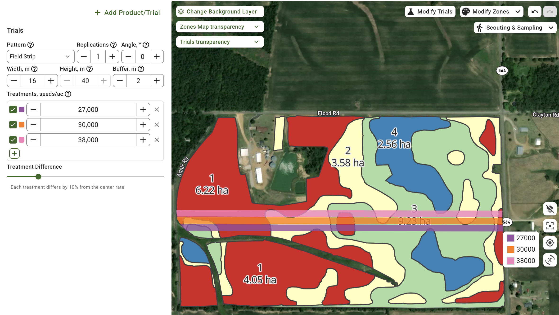


A variable rate prescription map tells your machine how much to apply in each part of a field instead of one rate everywhere. Building one takes five steps: gather the layers that describe the field, turn them into zones, set a rate per zone, export the file your display reads, and check it before you drive. Here is each step and the decisions that actually change the outcome.
What a variable rate prescription map is
It is a map file carrying a target rate for every part of the field. The machine reads its position, looks up the rate there, and adjusts the applicator on the move. The same idea covers seeding, fertiliser, lime, and crop protection. Only the rate column changes.
The point is not to apply less. It is to put the input where it returns something and take it away from where it does not.
What you need before you start
The one thing you cannot skip is an accurate field boundary. Everything else is a layer that explains why one part of the field behaves differently from another.
Useful layers, roughly in order of how often they carry real signal:
- Yield history. Several seasons beat one. One season mostly records that year’s weather.
- Soil sample results. Lab values for pH, phosphorus, potassium and organic matter anchor nutrient decisions to measurements rather than inference.
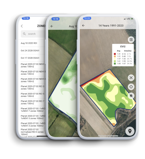
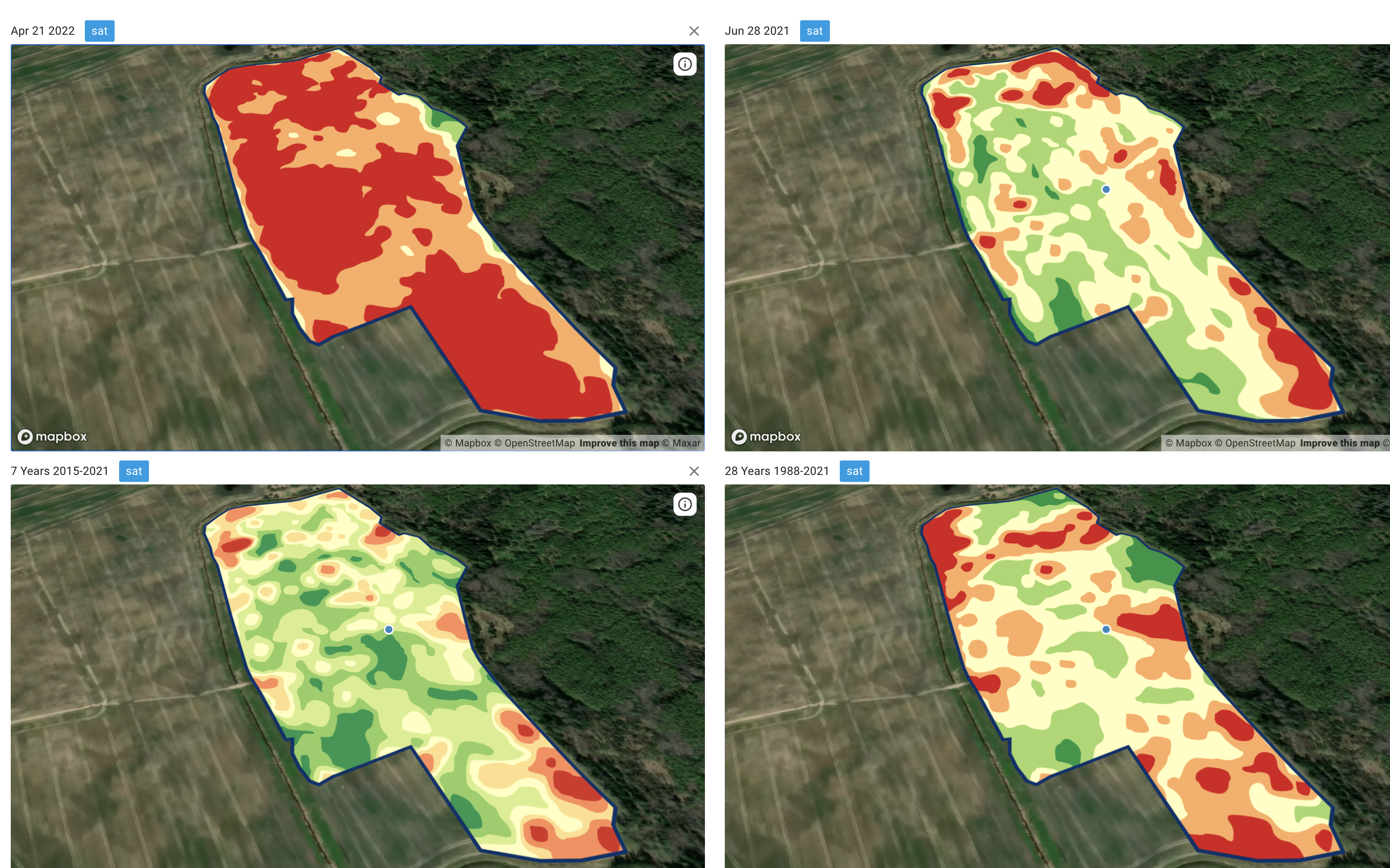
- Satellite history. Multi-year vegetation patterns show which parts consistently perform, which is closer to potential than any single image.
- Topography. Slope and water flow explain a lot of yield variation, especially in wet or drought years.
- Soil scans. Electrical conductivity maps texture cheaply and at high density.
The honest minimum is a boundary plus one good layer. Two or three that agree with each other is where confidence starts.
Step 1: pick the layers that explain this field
More layers is not automatically better. A layer earns its place when it separates parts of the field that really do behave differently.
The practical test is simple. Put the layer on screen and ask whether the pattern matches something you already know, the wet corner, the sandy ridge, the headland that always lags. If it matches, it is carrying signal. If it looks like noise or like last season’s weather, leave it out.
You can explore your own field data layer by layer in the browser before committing to anything. The post on why combining layers pays covers the reasoning behind picking a set rather than a single map.
Step 2: turn the layers into zones
Zones are the unit the prescription works in. Three to five is the usual answer for a field, and there is a reason it is not twenty.
Every extra zone makes the map look more precise while making each zone smaller and its average less reliable. It also asks the applicator to change rate more often than it physically can. A twenty zone map, applied by a machine that needs seconds to settle at a new rate, is a three zone map with worse edges.
Check the zone map before you go further. Two checks that take a minute:
- Does the zone pattern line up with what you know about the field on the ground?
- Do the zones hold up across seasons, or did one unusual year draw them?
If a zone map only makes sense in the year it was built, rebuild it from more history.
Step 3: set a rate for each zone
There are two honest routes, and they suit different situations.
Redistribute a fixed budget. You have decided to spend a set amount of nitrogen across the field. The prescription moves that same total toward the zones that respond and away from the ones that do not. Your spend stays flat and the return changes.
Calculate the rate agronomically. Each zone gets a rate derived from a removal or response equation using its own soil values and yield goal. Your spend changes and follows the agronomy.
A worked example of the first route. Say the field is 100 hectares, the flat plan was 150 kg N per hectare, so the budget is 15,000 kg. Zones come out at 30, 45 and 25 hectares, carrying high, medium and low yield potential. Shift roughly 15 percent off the low zone and put it on the high zone:
- High potential, 30 ha at 168 kg per ha
- Medium potential, 45 ha at 150 kg per ha
- Low potential, 25 ha at 128 kg per ha
That totals 15,000 kg. The same nitrogen, positioned differently.
Keep the steps modest on the first pass. Independent multi-year studies on variable rate nitrogen find the gains come from moderate reallocation rather than dramatic swings, and a conservative first prescription is easier to learn from. Iowa State University Extension publishes practical guidance on nitrogen rate decisions and on-farm trials.
Validate the rates with your agronomist, your crop plan, current soil tests, product labels, and local regulations before anything goes on the field. Zone maths does not override any of those.
Step 4: export the file your machine reads
Two formats cover most of the industry. Shapefile is widely accepted. ISO-XML is the ISOBUS standard and what most modern terminals prefer. Some displays want their own format, which is why platforms keep a list of what each expects. GeoPard writes the common ones, and the formats GeoPard writes shows what goes to which display.
If your data already lives in the John Deere Operations Center, the prescription can travel back there instead of moving on a memory stick.
Two things to get right on export:
- The rate column. Name it what the display expects and confirm the units are the ones the machine is set to. A map in kg per hectare loaded into a terminal set to pounds per acre will apply confidently and wrongly.
- The geometry. Zones should be clean polygons without slivers. Very thin shapes make the applicator chase rates it cannot hold.
Step 5: check the map before you drive
Three checks, all quick, all worth it:
- Rate range. Is the highest rate inside what the machine can apply, and the lowest above its minimum?
- Edges and exclusions. Do buffer strips, waterways and no-application areas carry a zero rate rather than being undefined?
- Total product. Multiply rate by area per zone and compare with what you planned to buy. A surprise here means something is wrong upstream.
Common questions
Do I need yield data to build a prescription?
No. Yield history is the most useful single layer, but soil results, multi-year satellite patterns, or a soil scan can each support a workable zone map. Yield data makes the result stronger and the post-season check possible.
How many zones should a field have?
Three to five for most fields. Go higher only when the field genuinely has that many distinct areas and the applicator can keep up with the rate changes.
Which file format should I export?
ISO-XML if your terminal supports it, shapefile as the general fallback, and the display-specific format when the machine asks for one. Check the units and the rate column name every time.
Will this work with my machinery?
If the applicator supports variable rate and the display reads a common prescription format, yes. Older machines that apply a single rate cannot execute a prescription, though the zone map still helps with soil sampling and planning.
Closing the loop
A prescription is a hypothesis about the field, and the season tests it. After harvest, line the yield data up against the rates actually applied and price each step, so the next map is built on evidence rather than assumption.
Ready to try the steps on a real field? Open management zones and prescription maps in GeoPard and start from the layers you already have.
VRA






 English
  German
  Ukrainian
  French
  Kazakh
  Portuguese
  Spanish
  Arabic
  Swedish
  Serbian
  Romanian
  Norwegian
  Finnish
  Lithuanian
  Estonian
  Latvian
  Croatian
  Slovenian
  Slovak
  Japanese
  Polish